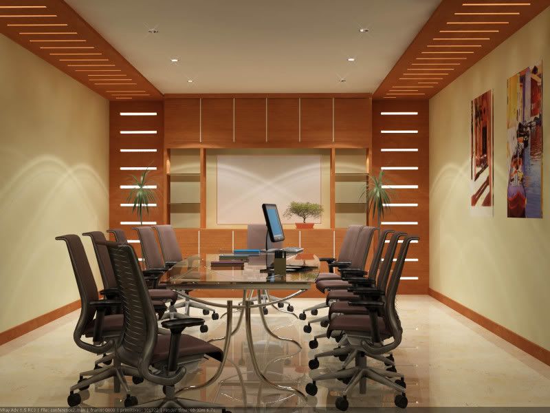
conference room
Posted: March 09, 2008
Post subject: conference room
Post subject: conference room
low res vray render - conference room design

_________________
interior designer / 3d visualizer
http://www.sharecg.com/pf/rpadc2002
http://www.pixila.com/portfolios/portfolio/?artist=200
http://rpadc2002.cgsociety.org/gallery

_________________
interior designer / 3d visualizer
http://www.sharecg.com/pf/rpadc2002
http://www.pixila.com/portfolios/portfolio/?artist=200
http://rpadc2002.cgsociety.org/gallery
Posted: December 26, 2008
Post subject:
Post subject:
Wow! Great Rendering!
What renderer did you use?
BTW the lights on the walls where do they come from?
What renderer did you use?
BTW the lights on the walls where do they come from?
Posted: December 26, 2008
Post subject:
Post subject:
| Andyba wrote: |
| Wow! Great Rendering!
What renderer did you use? BTW the lights on the walls where do they come from? |
thnks for the appreciation.
- its a vray render ( low res)
- the lights on the wall came from the spot light near the middle. a bit strange isnt it. i used a wide angled spotlight (ies photometric lights.)
_________________
interior designer / 3d visualizer
http://www.sharecg.com/pf/rpadc2002
http://www.pixila.com/portfolios/portfolio/?artist=200
http://rpadc2002.cgsociety.org/gallery
Nice render!!!
Looks professional..
Looks professional..
Posted: April 18, 2009
Post subject:
Post subject:
Wow... love the ambience of the rendering...
Posted: May 13, 2009
Post subject:
Post subject:
Wow that's pretty awesome! You had me fooled for a second, I totally thought that it was a photograph. Nice going!
Posted: July 26, 2009
Post subject:
Post subject:
DUDE! That's amazing! You definitely have skills! 
Posted: June 22, 2010
Post subject:
Post subject:
Nice. This picture looks awesome. I wonder where the lights on the wall come from?
_________________
My Animation Services
_________________
My Animation Services
Posted: July 02, 2010
Post subject:
Post subject:
Very nicely done.
Speaking from a taste standpoint, I prefer brighter lighting and a solid table rather than whats depicted here... it just doesn't encourage productivity to me. This conference room might be one for a more relaxed and non-rushed group (not very common) I guess.
Speaking from a taste standpoint, I prefer brighter lighting and a solid table rather than whats depicted here... it just doesn't encourage productivity to me. This conference room might be one for a more relaxed and non-rushed group (not very common) I guess.


