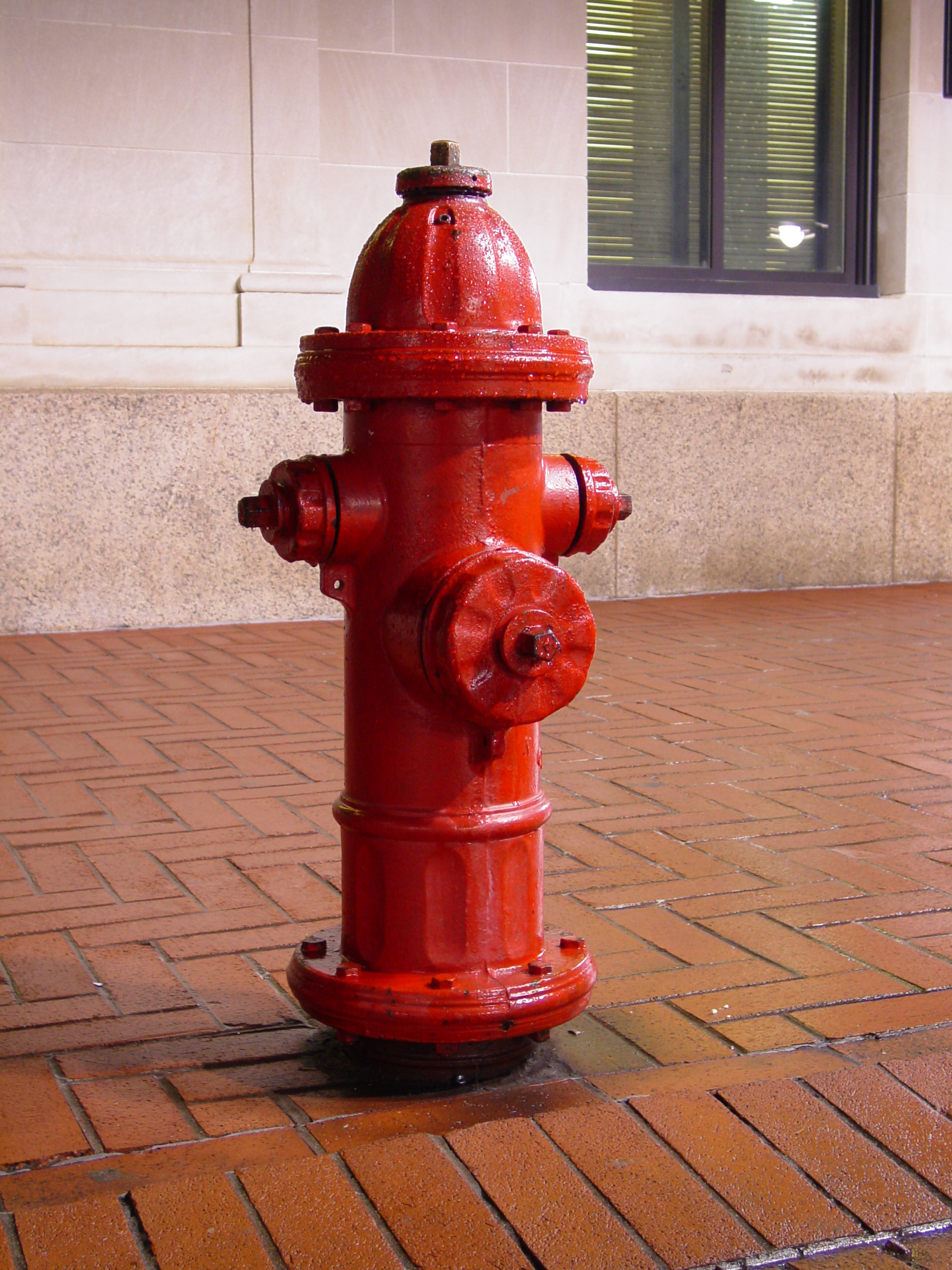
Fire Hydrant (part of city block environment)
Posted: May 12, 2010
Post subject: Fire Hydrant (part of city block environment)
Post subject: Fire Hydrant (part of city block environment)
Quick roughed out model of a fire hydrant. Critiques welcome, to note I am aware of the Ambient Occlusion and white background blowing things out of proportion  , sorry.
This is part of a bigger environment I am hoping to finish by then end of September as a portfolio piece. Yes, I will be adding textures to this later, I suck in this department, but will do it .
.
Software:
Maya 2010


This is part of a bigger environment I am hoping to finish by then end of September as a portfolio piece. Yes, I will be adding textures to this later, I suck in this department, but will do it
Software:
Maya 2010


Posted: May 12, 2010
Post subject:
Post subject:
Are you aiming at an environment artist position?
This is a good start. But it is too basic for this.
By looking at the mesh it is going to be a high poly model, so you can try adding some subtle details that are not obvious at first sight.
I suppose you are using this for reference:

This is a good start. But it is too basic for this.
By looking at the mesh it is going to be a high poly model, so you can try adding some subtle details that are not obvious at first sight.
I suppose you are using this for reference:

Posted: May 12, 2010
Post subject:
Post subject:
Yeah, I am shooting to become an environment artist. Thanks for the tips. As for the photo is close to that. I have a few reference photos I am following, mostly for texture reasons, but there are subtle details that I didn't add yet.
I am hoping the poly count won't be too high. I am experimenting a lot with Zbrush with hard surface modeling, mostly for normal maps. When I get home tonight I will do some more with this fire hydrant and see if I can't get the desired effects, the subtle details.
Edit:
I noticed that some of the objects are not placed in fully, *laugh*. I'll fix that too.
Posted: May 15, 2010
Post subject:
Post subject:
If you haven't planed on yet... add the the little support things with the ring inside of it. That little thin piece of metal under the parts where a fireman would put the hose into. Do you understand what I'm talking about?
If you add that, the model will be much more balanced.
If you add that, the model will be much more balanced.
Posted: May 16, 2010
Post subject:
Post subject:
I am not sure I follow. Which rings are you talking about?
Posted: June 02, 2010
Post subject:
Post subject:
Looking good so far. I tend to find that more subtle objects make for the most realistic renders (it's easy for architectural renders or cars to look very fake), and this could be a perfect portfolio piece. Keep it up!
Posted: August 31, 2010
Post subject:
Post subject:
This is a nice start. A little rough but very nice.
I understand it because this is still in progress and I am really hoping that the progress would be wonderful.
_________________
My Animation Services
I understand it because this is still in progress and I am really hoping that the progress would be wonderful.
_________________
My Animation Services
Posted: January 24, 2011
Post subject:
Post subject:
The hydrant is looking good so far. When you get to the texturing, you may want to do a normal map. It will make things look as though it is more detailed then what it really is.
Posted: February 02, 2011
Post subject:
Post subject:
So far, it looks good. I'm really interested to see the texture. There's a lot that will come through with the texture. If you're going to realism, remember to add wear and rust on the appropriate areas, like areas where you think it would be used a lot would be more worn with paint exposed and such.
Posted: March 09, 2011
Post subject:
Post subject:
Great, I was working on similar model awhile ago.
Here is good example of next-gen hydrant model: jeremiahbigley . com /Subpages/Thumb_03/Thumb_03.html
Here is good example of next-gen hydrant model: jeremiahbigley . com /Subpages/Thumb_03/Thumb_03.html
Posted: November 18, 2011
Post subject:
Post subject:
Nice little objects there! Needing a bump map i believe
Posted: November 26, 2011
Post subject:
Post subject:
I wish I knew what a bump map was 
Posted: December 21, 2011
Post subject: good start
Post subject: good start
yes,it far from good environment artist but i see your potential and hope to see the developing work in the future
Posted: February 06, 2012
Post subject:
Post subject:
Looking really good! The textures are really going to enhance it.
Posted: February 08, 2012
Post subject:
Post subject:
Looks great! How long did this take?


